Misleading Graphs... and how to fix them!
One, perhaps underestimated, aspect of any data-related job is presenting and visualizing your results. Communicating the data that you have at your disposal can be incredibly difficult. With that comes the possibility of accidentally creating misleading graphs.
Although most of us know about the many issues pie charts can present (here, here, and here), there are many ways charts could be misleading.

To bring this into perspective, I have found myself creating misleading charts in the past and have to be careful of not doing that still!
And I would argue that most people have this problem. We are humans after all and heavily subjected to our biases.
Be aware of the pitfalls that lead to misleading graphs
In this article, we will go through common mistakes in graphs and define methods for fixing them.
NOTE: With data visualizations, many exceptions to the rules can be found. Keeping that in mind, the principles below are merely guidelines and definitely not ground-truths.
1. Manipulating the Y-axis
Arguably, the most common form of misleading graphs is one that has its Y-axis manipulated. When comparing large numbers with each other many try to exclude zero from the Y-axis in order to better show the differences between instances.
This can be highly misleading as it seemingly blows up the differences between instances. It is important to know if you are looking at the relative or absolute differences between values.
Let us take a look at a real-world example where the Y-axis has been manipulated:

Visually, it seems from the example above that the number of people getting welfare has been doubled. However, since they start from 94,000,000 the differences are very much exaggerated.
Solution
There are two solutions to this problem.
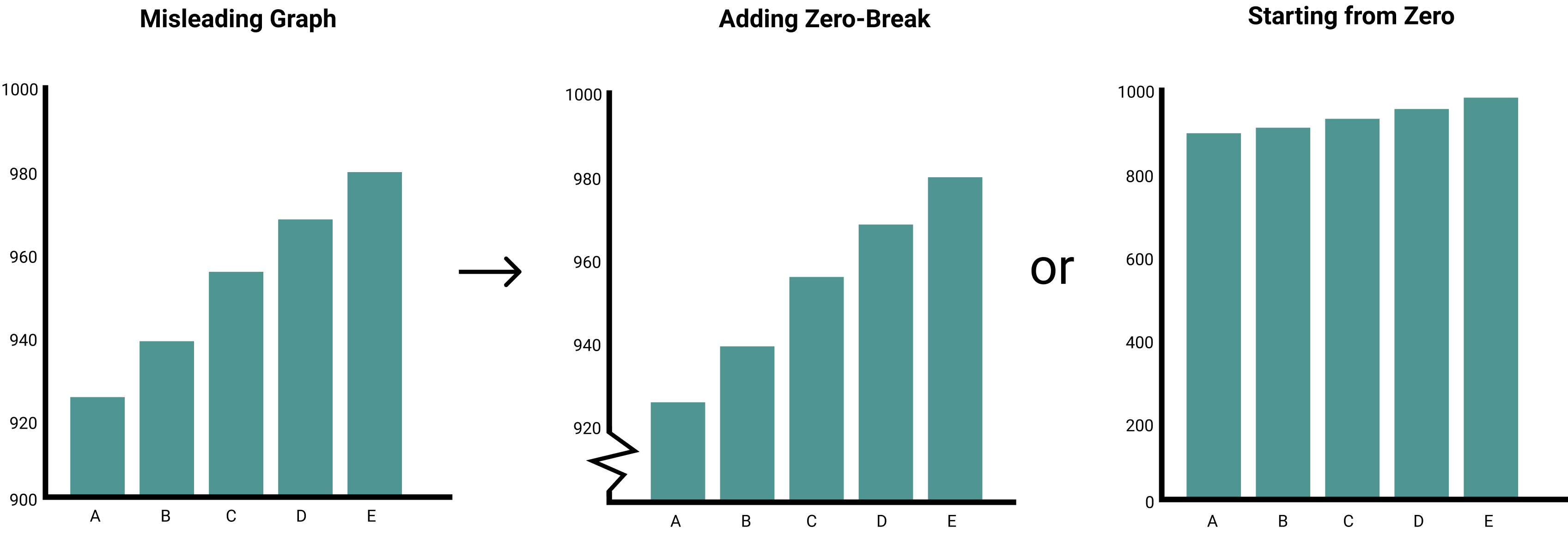
First, simply include the zero value into your graph. It will show the data as is without the difficulties of reading the Y-axis.
Second, there may be times when adding zero is actually quite misleading. Let’s say that you want to visualize the human body temperature on a scale from 0–100 ˚C. That kind of scale would prevent you from spotting a life-threatening increase of a few degrees in a patient. In this case, removing zero makes sense.
In that case, I would advise you to add a zero-break to communicate that you have removed zero from the graph. Being transparent in your data visualization is exceedingly important.
2. Two Y-Axes
There may be times when you want to visualize two lines that have different Y-axes. The most well-known examples are created by Tyler Vigen who created a bunch of interesting visualizations showing spurious correlations.
A spurious correlation is when two events or variables are seemingly associated but are not causally related. You can create this effect by matching the Y-axes of two different events.
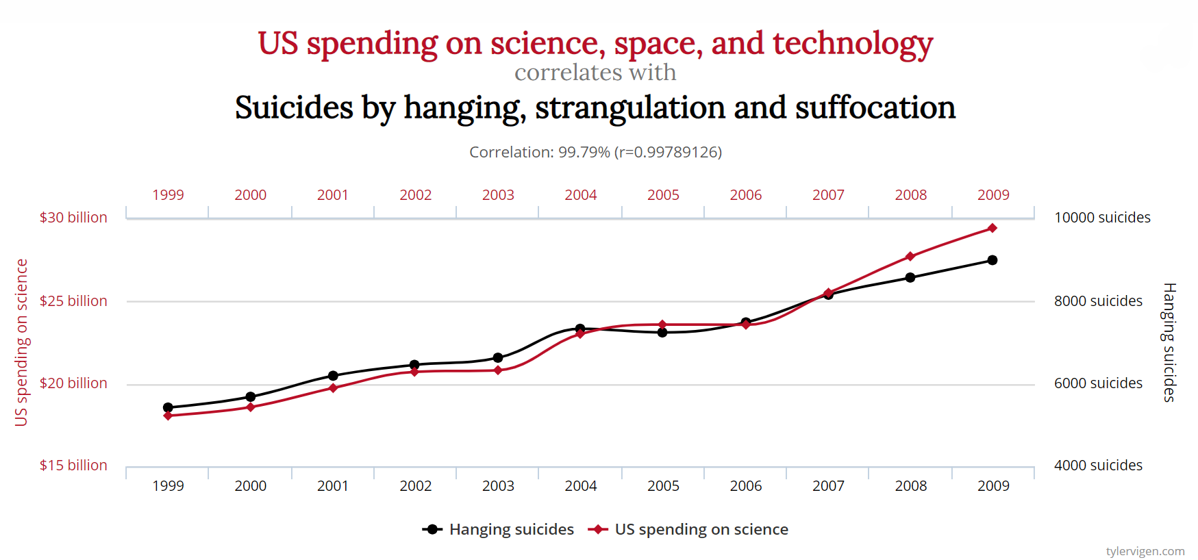
The result is the amazing visualization above. By overlapping the two lines it now seems like any spending on science is related to suicides. In reality, this is most definitely not the case and a great example of a misleading graph with two Y-axes.
Solution
Including zero into both Y-axes is a quick fix that can prevent graphs from being misleading. However, you still might stumble upon a spurious correlation if your lines happen to overlap without any provable causal relationship.
This is when you should consider not showing the graph at all. When you present such relationships, it is important that you can back them up with additional data, experiments, or results.
3. 3D Graphs
Aside from pie-charts, this is a personal pet-peeve of mine…
3D graphs with 2 axes!
These graphs throw off proportions and have a tendency to make things look larger or smaller depending on their angle.
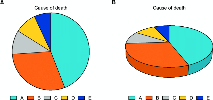
The above example is taken from a paper by Junyong In and Sangseok Lee where they research how data presentation can present and distort information.
We can see from that example that cause of death A between the two charts looks very different. In fact, to me, A and B look quite similar in the 3D graph!
Solution
I would argue that there are not many cases out there where a 3D graph would be more informative than a 2D graph with the same number of axes.
Don’t use 3D graphs!
In general, I would advise you to prevent using 3D graphs as it is too easy to fall into its distortion trap.
4. Improper scaling
To make visualizations more visually appealing, some tend to use images and pictograms in their charts. Although this can enhance the graph there is a real chance of creating a misleading graph!
The issue with pictograms can be found in their relative sizes. Let’s say you have two values, 100 and 300, and you want to visualize them using pictograms as bars.
If you were to scale them uniformly it creates a perceptually misleading comparison. Typically, people tend to interpret the area of the pictogram and not only their height.

The figure above shows how resizing a pictogram could lead to a misleading graph. By matching the height to the value you actually square the difference thereby exaggerating the larger pictogram.
Solution
The solution is rather straightforward. Instead of making people focus on the area of the pictogram make them focus on the height instead. You can achieve this by stacking the pictograms instead of resizing the area.

5. Cherry picking
One of the most troubling methods for creating misleading charts is cherry picking. Cherry picking is the act of selectively picking out the evidence that supports your point of view while disregarding data that does not.
When you expect certain things from the data it is surprisingly easy to fall into this trap. Unfortunately, there are those that are knowingly cherry picking the data that suits them best.
For example, the figure below shows the global temperature from 1997 until 2012. The intention of this graph is to invalidate claims that global temperatures are rising.
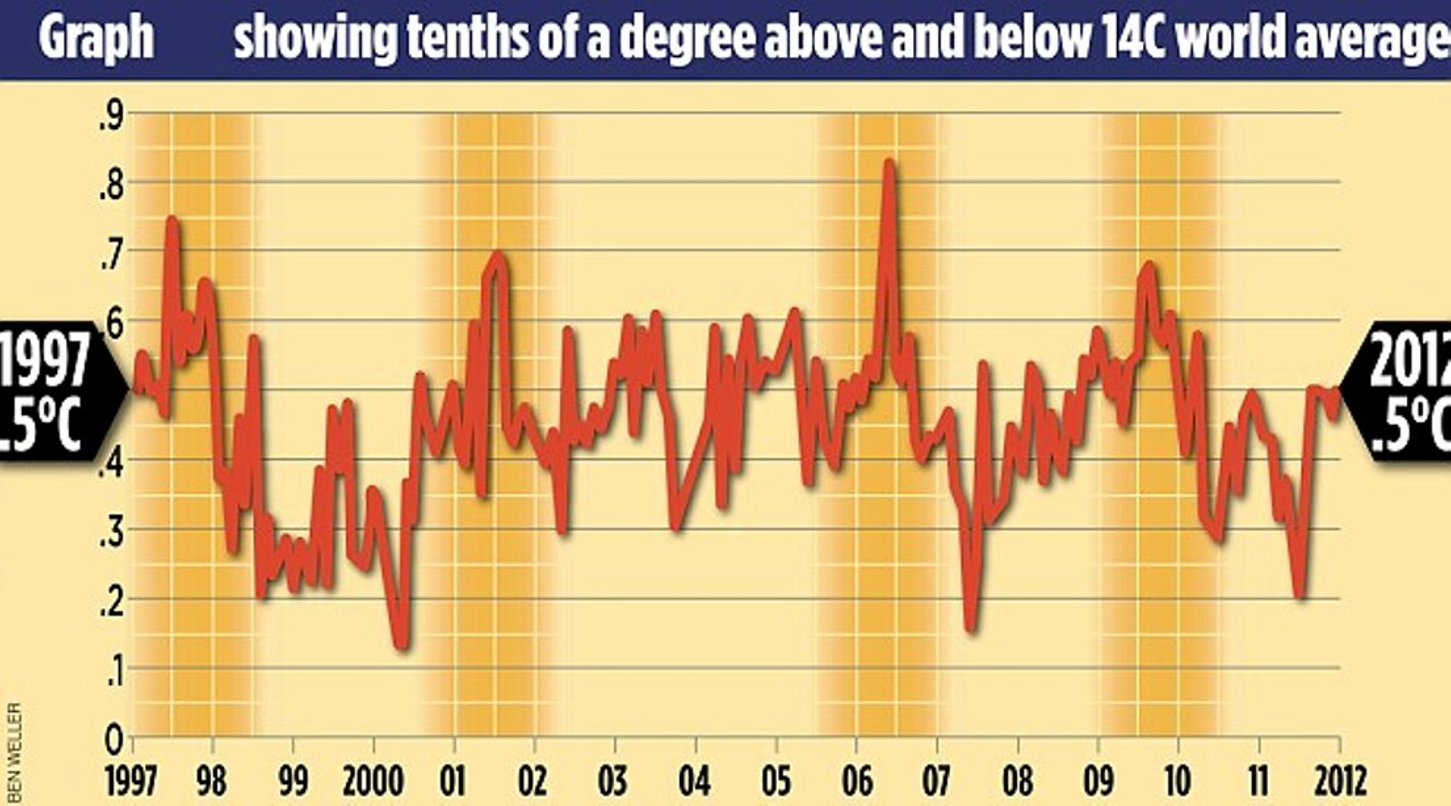
Indeed, from the graph, it seems that temperature has been stable for a few years. However, this graph is highly misleading!
The graph cherry picked the 15 years that validate their claims while ignoring anything that happened up to that point.
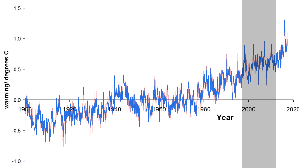
If you were to add all average temperatures from 1900 until 2012 you will see a much different view as illustrated in the image above.
You can see that if you were to select a small portion of the data you can easily mislead your audience.
Solution
It is important that you ask yourself the following:
“What data am I not seeing?”
Answering that question could help you in preventing creating a graph that only presents a single biased perspective of the data.